Sometimes you finish an animation and find the colors dull. Or you just want to change the tones to match an aesthetic.
Instead of editing each frame one by one, you can just correct colors during post-production in one go.
Read on for tips on getting started with color correction!
What is Color Correction?
That's how you go from a rough-looking 3D scene to an appealing final product:
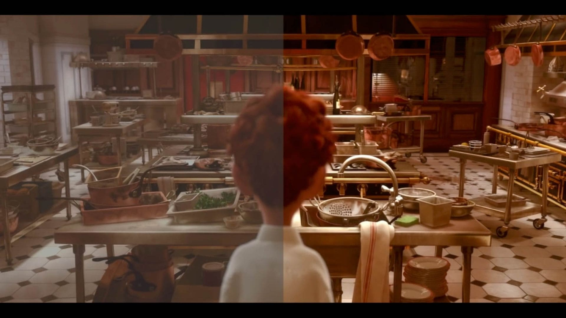
See the difference? It's immediately noticeable.
Why Is Color Correction Important?
Different scenes are animated at different times or by different artists. Mistakes can result in slight variations in color tones. Color correction fixes that and ensures all scenes maintain a consistent color palette.
Colors significantly influence the emotional tone of a scene. Through color correction, animators can also emphasize particular feelings like cooler tones to evoke sadness or warmer hues for comfort and happiness. Specific colors are often used to communicate certain themes or motifs within a story.
Depending on the production's style, color correction can make an animation appear more lifelike or create an aesthetic. For instance, a realistic animation might require precise color adjustments to match natural lighting conditions, while a stylized piece might benefit from exaggerated color schemes.
The Elements of Color
To understand how color correction works, you have to be familiar with the fundamental elements of color: hue, saturation, brightness, and the processes of tinting and shading.
- Hue is the color family, or the base color of your animation. The pure color without any tint or shade. Tools like color wheels help you visualize and select harmonious hues for your compositions.
- Saturation defines the intensity or purity of a color. High saturation means vivid colors, while low saturation leads to muted colors. High saturation signals excitement and activity, while desaturated colors suggest nostalgia or solemnity.
- Brightness dictates how light or dark a color appears. It significantly impacts the mood and depth of a scene. You can use brightness shifts to create contrast and build visual interest: a bright character against a dark background creates a focal point.
Tinting involves adding white to a color to lighten it, while shading adds black to darken it. These techniques create lighting effects.
To stay consistent throughout production, animators use a color script—a strategic outline of the color scheme for the entire project.
1. White Balance Adjustment
White balance adjustment removes unrealistic color casts in your animation to make white appear as pure white and all other colors look natural. This process involves tweaking the colors in your scenes to align them with how they would appear under neutral lighting conditions, mimicking the way our eyes perceive color in different lighting environments.
Most animation and editing software includes a white balance tool to automatically adjust your scene based on a selected neutral point (white or gray areas).
In Blender for example, you can find the white balance feature in color management panel of the render properties.
2. Exposure Correction
Exposure correction changes brightness levels to make sure that the details in the darkest and brightest areas are visible and correctly balanced: it tweaks the amount of light in your frames so that your audience can see the intended details and colors clearly, without any parts being underexposed (too dark) or overexposed (too bright).
Histogram tools help gauge correct exposure levels by showing the tonal values in your image: the distribution of shadows, midtones, and highlights. You can use scopes to make sure each scene has the same level of exposure unless you animate flashback or dream sequences.
Blender proposes the Exposure node to increase the brightness of an area. For example, a window in a room.
3. Contrast Enhancement
Contrast enhancement alters the difference between the lightest and darkest parts of an image. By amplifying these differences, animators can make visuals more engaging.
This is achieved by changing the brightness levels to allow each element within a frame to stand out correctly. A high-contrast area naturally draws the eye.
4. Color Balance Adjustment
Color balance adjustment is the process of changing the intensity of the colors in a scene to achieve a desired visual tone: tuning the colors so that they complement each other and create a harmonious look.
If you have an animated scene set at sunrise, you want to achieve a balance that reflects the gentle warmth of the early morning light. You start by identifying the dominant color of your sunrise scene on the color wheel, which might be a soft yellow-orange, and to enhance this warmth you can slightly adjust the balance towards red, to give the impression of a gentle morning.
To see color balance in action, you can look at the interaction between colors on the color wheel: if your scene has too much yellow, which sits next to the greens on the wheel, it might inadvertently pull in a cool green hue, contradicting your intention. By carefully adjusting the balance, you can have the yellow remain soft and inviting without tipping into the spectrum's cooler side.
5. Saturation Control
It's the adjustment of intensity or purity of colors in your frames.
Say you're animating a serene forest scene at dawn: opting for muted, desaturated colors illustrates a calm and peaceful atmosphere. Inversely, boosting saturation would make everything look exaggerated and distract from the narrative. Oversaturation can also cause loss of detail.
If the stylistic choice is to make colors pop, then a more saturated palette can be both intentional and effective.
A simple rule of thumb is to start with a neutral baseline and incrementally adjust.
6. Color Grading
Color grading is changing the colors in your animation to create a specific look or mood.
Consider a scene where your character is on a sunny beach. By applying color grading techniques, you can enhance the brightness of the sky, saturate the colors of the ocean to create a more vibrant and inviting atmosphere and adjust the skin tones of characters to look more natural under sunlight.
One way to achieve consistent and repeatable color grading is by using Color Lookup Tables (LUTs): predefined color settings that can be applied to your animation to quickly achieve a professional look.
Video scopes / histograms again allow you to precisely evaluate color balance, exposure, and brightness levels and avoid colors that are too bright or too dark.
7. Skin Tone Correction
Skin tone correction refines the color of character skin colors to make them look natural and consistent across various lighting conditions and scenes.
Strong sunlight may wash out the colors and make skin tones appear overly pale or unrecognizable.
To correct this, animators use software tools to adjust the color balance. For example, by increasing the saturation slightly in warmer tones (reds and yellows), skins can retain their vividness under harsh light.
Conclusion
Color correction is an important step in post-production to polish the final result. Different techniques bring different benefits, and it's important to understand how they work to get the most out of them.
Depending on the DCC tool you use, your workflow will change, but the principles are roughly the same. Have a look at Blender's color management section to learn more about color correction for rendering.
If your animation has multiple shots in the same setting, animators usually pick one "hero frame" with the correct balance and use it as a reference for other scenes to speed up the matching process while helping with visual consistency.
Color correction is not a substitute for good color design though: you need to proactively pick color palettes that suit your story from the conception stage. Have a look at this guide on picking a color palette for character design for more details.