
If you’ve ever written a Blender script, you’ve probably realized that getting the feature right is only half the battle: the other half is getting someone else to use it! A clean user interface is a must to share and sell Blender add-ons.
In this guide, you’ll learn how to build user interfaces for your Blender add-ons using the built-in layout system. We’ll cover the most common types of UI components, where panels can appear, and walk through a minimal working example. By the end, you’ll know how to give your add-on a Blender-native graphical interface.
You can find the complete source code for the example integration showcased in this guide on our GitHub:
🔗 https://github.com/cgwire/blender-ui-addon-script
1. Common UI Components
In Blender, every element of the user interface has its equivalent in the Python library. You build UI by creating classes that inherit from one of the following types:
bpy.types.Panel- for custom panels (the most common)bpy.types.Menu- for menus and submenusbpy.types.Operator- for actions or tools that can be run from buttons
Each of these classes can implement a draw(self, context) method where you describe what the interface should look like using layout commands. Blender’s layout system handles the spacing, alignment, and positioning automatically: it's a declarative UI system where you just describe what should appear and in what order.
Here are the most common layout elements you’ll use:
Basic Display Elements
- Label - Displays plain, non-interactive text. Format:
layout.label(text="Hello!") - Separator - Adds vertical space between items for readability. Format:
layout.separator()
Buttons, Inputs, Props, and Operators
- Operator Button - Creates a clickable button that triggers an operator (a function registered as a Blender command). You can use this for actions like exporting, duplicating, or running a custom script. Syntax:
layout.operator("myaddon.some_action", text="Run Action")
The layout.prop() method is used to display editable Blender properties which are either built-in data (like context.object) or your own custom properties. For example, layout.prop(context.object, "name") shows an editable text field for the object’s name. Blender automatically chooses the right widget (text box, slider, checkbox, etc.) based on the property’s type:
- Checkbox (Boolean property) - Displays a toggle checkbox. Example:
layout.prop(context.object, "hide_viewport") - Number Field / Slider (Float or Int) - Displays a numeric input, often with a slider. Example:
layout.prop(context.object, "location", index=0, text="X Location") - Dropdown Menu (Enum property) - Displays a dropdown list when the property is an EnumProperty. Example:
layout.prop(context.object, "type") - Text Input - Displays a text box for string properties. Example:
layout.prop(my_settings, "username")
Organizing the Layout
To keep your UI structured and easy to understand, Blender provides layout containers like rows, columns, and boxes.
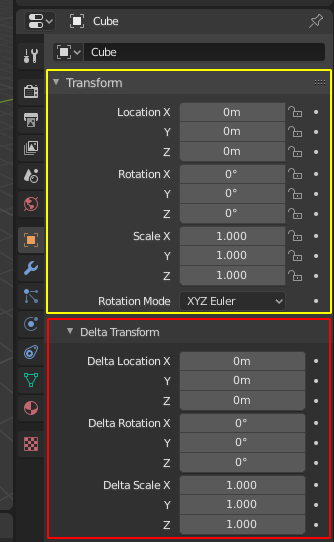
A panel contains rows and columns. Rows and columns contain properties, operators, and labels. Blender automatically handles padding, alignment, and scaling to match the theme and layout rules.
- A row (horizontal grouping) puts elements next to each other horizontally:
row = layout.row()
row.prop(obj, "location")
row.prop(obj, "rotation_euler")- A column (vertical grouping) stacks elements vertically:
col = layout.column()
col.prop(obj, "scale")
col.prop(obj, "dimensions")- box (Visual grouping) draws a bordered box that visually groups related controls, like sections:
box = layout.box()
box.label(text="Transform Settings")
box.prop(obj, "location")
box.prop(obj, "rotation_euler")
For the full list of UI components, have a look at the User Interface page of the official Blender documentation.
2. Where You Can Put UI Panels
When you create a custom panel in Blender, you can decide where in the interface it appears and what region it occupies with two key class attributes:
bl_space_type- which editor or workspace your panel belongs to (for example, the 3D View, the Properties Editor, or the Node Editor).bl_region_type- which part of that editor the panel appears in (for example, the sidebar, toolbar, or main window).
Here is a list of the most typical areas where you might place a custom panel:
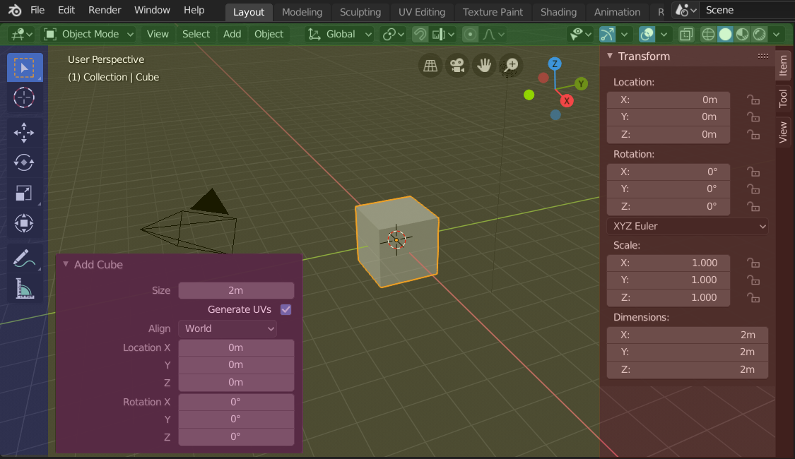
- The 3D view sidebar appears in the right-hand N-panel sidebar of the 3D Viewport. This is the most common location for modeling, rigging, or scene tools:
bl_space_type = 'VIEW_3D'
bl_region_type = 'UI'- You can add panels inside the Properties Editor, among the Object, Material, or Scene tabs. Use this when your add-on deals with materials, objects, render settings, or scene properties:
bl_space_type = 'PROPERTIES'
bl_region_type = 'WINDOW'- In the UV/Image Editor sidebar (useful for texture tools or image utilities):
bl_space_type = 'IMAGE_EDITOR'
bl_region_type = 'UI'- In the sidebar of the Shader, Geometry Node, or Compositor editors for tools that work with nodes, shaders, or procedural systems:
bl_space_type = 'NODE_EDITOR'
bl_region_type = 'UI'
The best panel location depends on your tool’s purpose:
- Modeling / Object tools → 3D View sidebar (
VIEW_3D+UI) - Material or render settings → Properties editor (
PROPERTIES+WINDOW) - Texture utilities → Image editor sidebar (
IMAGE_EDITOR+UI) - Shader / Geometry tools → Node editor sidebar (
NODE_EDITOR+UI)
Picking the right space helps users find your add-on where they naturally expect to, keeping your UI consistent with Blender’s.
3. Minimal Example: Custom Panel in the 3D View Sidebar
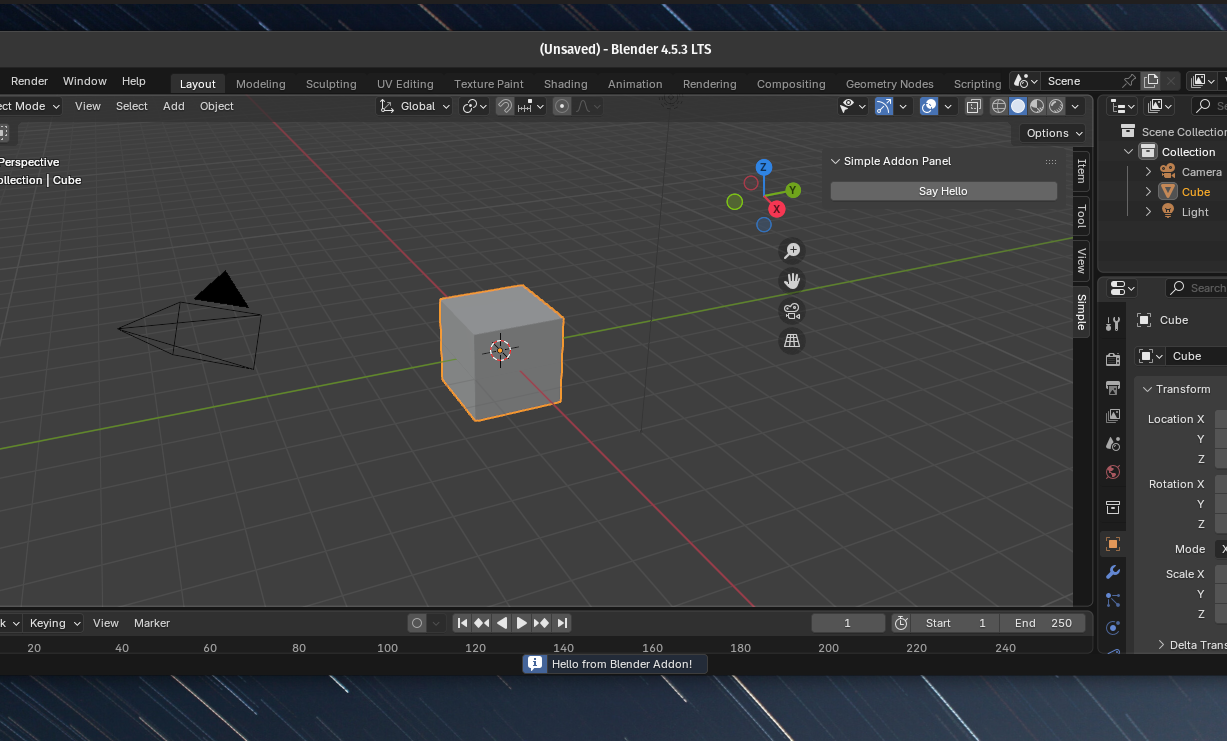
Let's experiment with a simple plugin: a custom panel in the 3D view sidebar that displays a "hello world" text alert when clicking on a button.
1) bl_info - addon metadata
We start by specifying the add-on metadata to tell Blender how to present our add-on to a potential user:
bl_info = {
    "name": "Simple Addon Example",
    "author": "Your Name",
    "version": (1, 0),
    "blender": (4, 0, 0),
    "location": "View3D > Sidebar > Simple Tab",
    "description": "A simple example addon that prints a message",
    "category": "3D View",
}bl_infois a module-level dictionary Blender uses to show addon info in Preferences → Add-onsname:human-readable name shown in the listauthor:author stringversion:tuple representing addon versionblender:minimum Blender version this addon targets (tuple)location:where the addon UI appears (helpful for users)description:short description used in the UIcategory:category grouping in the Add-ons list
It's essential to keep your bl_info accurate, as Blender reads it when scanning installed add-ons.
2) Define an operator class
We then define an Operator subclass. Operators are the official way to perform actions in Blender: they can be invoked from UI, shortcuts, search menu, etc.
class SIMPLEADDON_OT_hello(bpy.types.Operator):
    bl_idname = "simple_addon.say_hello"
    bl_label = "Say Hello"
    bl_description = "Prints a message to the console"

    def execute(self, context):
        self.report({'INFO'}, "Hello from Blender Addon!")
        print("Hello from Blender Addon!")
return {'FINISHED'}bl_idname- A unique identifier string in the form"module_name.operator_name", all lowercase and with a dot. This is how you call the operator from code or UI (bpy.ops.simple_addon.say_hello()).bl_label- User-facing label that appears on buttons/menus.bl_description- Tooltip/description shown in the UI.execute(self, context)- Core method called when the operator runs (synchronous execution).contextgives access to Blender's current state (active object, scene, area, etc.).self.report({'INFO'}, "…")shows a small message in Blender's info bar / status (good for user feedback).print("…")prints to the system/Blender console (useful for debugging). Returns a set like{'FINISHED'}or{'CANCELLED'}. Blender uses this result to know whether the operator completed successfully.
3) Panel class - UI placement
We can then get to the Panel subclass to add UI in Blender:
class SIMPLEADDON_PT_panel(bpy.types.Panel):
    bl_label = "Simple Addon Panel"
    bl_idname = "SIMPLEADDON_PT_panel"
    bl_space_type = 'VIEW_3D'
    bl_region_type = 'UI'
    bl_category = 'Simple'

    def draw(self, context):
        layout = self.layout
layout.operator("simple_addon.say_hello")bl_label- panel title shown in the UI.bl_idname- unique panel identifier.bl_space_type = 'VIEW_3D'tells Blender this panel belongs in the 3D Viewport area.bl_region_type = 'UI'places it in the right-side region (the N-panel). Other regions exist (e.g.,'TOOLS', 'WINDOW').bl_category = 'Simple'- The tab name in the sidebar. The panel will appear under a tab labeled “Simple”.draw(self, context)is called to draw UI layout.self.layoutis aUILayoutobject used to place buttons, labels, properties, etc.layout.operator("simple_addon.say_hello")creates a button that, when clicked, calls the operator with bl_idname"simple_addon.say_hello". The button text is taken from the operator'sbl_label.
4) Register / unregister functions
Blender requires classes that define UI, operators, panels, properties, etc., to be registered so Blender knows about them:
def register():
    bpy.utils.register_class(SIMPLEADDON_OT_hello)
    bpy.utils.register_class(SIMPLEADDON_PT_panel)

def unregister():
    bpy.utils.unregister_class(SIMPLEADDON_PT_panel)
bpy.utils.unregister_class(SIMPLEADDON_OT_hello)bpy.utils.register_class(Class)registers a class;unregister_classremoves it.- It's important to unregister classes in the reverse order of registration, especially when classes reference each other. This is why the panel is unregistered before the operator.
- When the addon is enabled in Preferences, Blender calls
register(). When disabled, it callsunregister().
We put the full code in a Python file addon.py:
bl_info = {
    "name": "Simple Addon Example",
    "author": "Your Name",
    "version": (1, 0),
    "blender": (4, 0, 0),
    "location": "View3D > Sidebar > Simple Tab",
    "description": "A simple example addon that prints a message",
    "category": "3D View",
}

import bpy

class SIMPLEADDON_OT_hello(bpy.types.Operator):
    bl_idname = "simple_addon.say_hello"
    bl_label = "Say Hello"
    bl_description = "Prints a message to the console"

    def execute(self, context):
        self.report({'INFO'}, "Hello from Blender Addon!")
        print("Hello from Blender Addon!")
        return {'FINISHED'}

class SIMPLEADDON_PT_panel(bpy.types.Panel):
    bl_label = "Simple Addon Panel"
    bl_idname = "SIMPLEADDON_PT_panel"
    bl_space_type = 'VIEW_3D'
    bl_region_type = 'UI'
    bl_category = 'Simple'

    def draw(self, context):
        layout = self.layout
        layout.operator("simple_addon.say_hello")

def register():
    bpy.utils.register_class(SIMPLEADDON_OT_hello)
    bpy.utils.register_class(SIMPLEADDON_PT_panel)

def unregister():
    bpy.utils.unregister_class(SIMPLEADDON_PT_panel)
    bpy.utils.unregister_class(SIMPLEADDON_OT_hello)
4. Running and Packaging Your Add-on
Once you’ve written your add-on script, you can load it into Blender and test it right away. No tools required.
- Save your script - Save your Python file with a clear name like
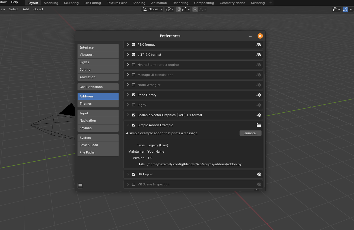
my_addon.py. - Open Blender’s Add-ons Preferences - Go to Edit → Preferences → Add-ons. This is where Blender manages all installed extensions.
- Install the add-on - Click the Install… button at the top of the preferences window.
Select your my_addon.pyfile and click Install Add-on. - Enable it - After installing, your add-on should appear in the list. Find it (you can search for “My Add-on”) and check the box to enable it if it's not already.
- Check it in the interface - Open the 3D Viewport, open the sidebar, and look for the tab named Simple. Your custom panel should be there, ready to use!
When you want to share your add-on with others, you can upload it to GitHub, Blender Artists, or Gumroad for distribution. Add a short README.md explaining what the add-on does and how to install it.
For add-ons with multiple files (e.g. separate modules, icons, or resources), create a folder then zip the entire folder (my_addon.zip) and share that. Blender can install .zip archives directly via the same Install… button so no need to extract it beforehand. The main entry point must be named __init__.py, since Blender treats it as a Python package.
Conclusion
Creating UI for Blender add-ons is intimidating at first, but it’s one of the easiest ways to share a tool you created. Once you understand how panels and layouts work, you can quickly add buttons, properties, and organized sections that users will find intuitive.
Have a look at the code repository on Github to try the example yourself.
Start small by adding a simple panel, a label, and a button to create an action, and build from there!